
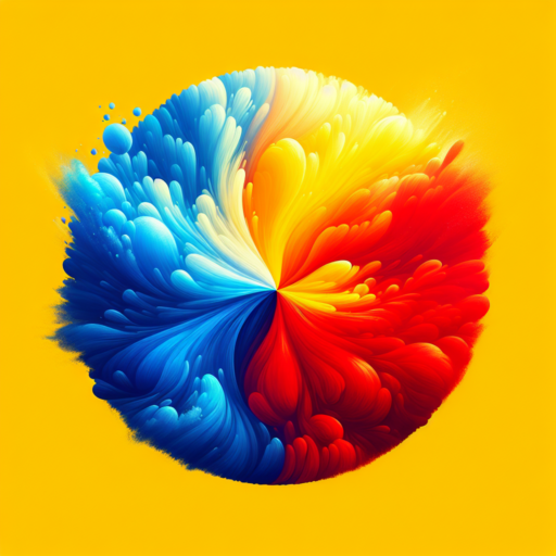
Understanding the Psychological Impact of 3 Colors
The study of color psychology takes us deep into understanding how different hues can influence mood, behavior, and even decisions. In this exploration, we spotlight the psychological impact of three specific colors: red, blue, and yellow. Each of these colors carries distinct emotional and psychological connotations, deeply rooted in cultural and individual experiences.
Red: The Color of Arousal and Energy
Red is a powerful color that universally signifies alertness, excitement, and passion. Its ability to demand attention makes it a frequent choice in marketing and advertising, aiming to evoke strong emotions ranging from love to anger. The psychological impact of red is deeply ambivalent; it can stimulate physical responses, increasing heart rate and enhancing human metabolism, but it can also signify danger, playing on primal instincts.
Blue: The Soothing Spectrum
In stark contrast to red, blue evokes feelings of calmness and serenity. Often associated with the sky and the sea, blue is lauded for its ability to slow down human metabolism and produce a calming effect. This makes it an excellent choice for spaces promoting relaxation and focus. Beyond its pacifying effect, blue also stands as a symbol of trust, reliability, and stability, making it a favored color in corporate and technological environments.
Yellow: The Hue of Happiness and Caution
Yellow, with its bright and energizing aura, is often linked with happiness, creativity, and warmth. It has the unique capacity to lighten and brighten environments, encouraging communication and stimulating mental activity. However, when overly used or presented in too bright a hue, it can lead to feelings of frustration and anger, serving as a reminder that color impacts can be double-edged. Significantly, yellow is also employed to signal caution, illuminating warnings and cautious spaces.
The Role of 3 Colors in Brand Identity
In exploring the essence of brand identity, colors play an instrumental role, notably, three colors often emerge as central to creating a memorable and effective palette. These colors do more than just please the eye; they communicate a brand’s values, personalities, and aspirations. Understanding the interplay of these colors can transform how audiences perceive a brand.
The first color in a brand’s triadic palette typically sets the tone. It’s the color that captures immediate attention and is often associated with what the brand represents at its core. This dominant hue can evoke specific emotions or values such as trust, excitement, or calmness. The choice of this primary color is strategic, aimed at ensuring the brand stands out in the consumer’s mind.
The second and third colors in the palette serve to complement and contrast with the primary color. They add depth and versatility to the brand’s visual representation. These supporting colors are chosen to create a cohesive look that can be versatile across different mediums. They help in highlighting key messages and in distinguishing sub-brands or product lines under the same umbrella, enhancing the overall brand identity.
Top Triadic Color Combinations for 2023
In the ever-evolving world of design, staying ahead of the curve is crucial for creating visually stunning and impactful content. As we step into 2023, the focus on dynamic and vibrant color palettes remains at the forefront of design trends. Among these, triadic color combinations stand out for their visually appealing and balanced harmony. Understanding and utilizing these top triadic color combinations can elevate your project to the next level, ensuring it resonates with your audience.
Triadic color schemes involve using three colors that are evenly spaced around the color wheel, offering a rich contrast while retaining balance and color richness. This year, we’re seeing a shift towards combinations that blend both warmth and coolness, crafting spaces that feel fresh and invigorating. One noteworthy combination embraces the boldness of primary colors – red, blue, and yellow. This classic mix has been reimagined with muted tones to suit modern tastes, proving that tradition can meet contemporary in harmonious ways.
Another emerging triadic scheme for 2023 involves more adventurous and unconventional choices. Think the lushness of forest green, paired with the depth of indigo and contrasted with a vibrant coral. This palette brings an exotic and luxurious feel to any space, perfectly aligning with the growing trend for incorporating natural elements with a twist of opulence. By exploring these top triadic color combinations, designers are not only making bold statements but are also creating environments that offer a unique visual and emotional experience.
No se han encontrado productos.
How to Use 3 Colors in Web Design Effectively
When it comes to web design, color selection plays an integral role in shaping the user’s experience and interaction with your website. Using just three colors in your design can create a visually appealing and cohesive appearance, but it requires strategic choice and application. Understanding the principles of color theory, contrast, and harmony can elevate the effectiveness of a tri-color palette and enhance the overall user experience.
Choosing Your Three Colors
Begin by selecting a dominant color that aligns with your brand identity or the emotion you wish to evoke. This color will cover the largest areas of your site, such as backgrounds or large sections. The secondary color should contrast well with the primary, used for call-to-action (CTA) buttons, highlights, or headlines. The accent color, the third color in your scheme, is pivotal for drawing attention to key information or interactive elements. It’s crucial to maintain a balance, ensuring that the visual hierarchy of the site is clear and that the colors don’t compete for the viewer’s attention.
Implementing Color Psychology
Understanding color psychology can significantly impact how your users perceive your website. Each color conveys different emotions and messages. For instance, blue can evoke trust and security, making it a favorite for technology and finance websites. Warm colors like red or orange, known for their energizing qualities, are effective for call-to-action buttons. Use the accent color sparingly to highlight important elements without overwhelming the user’s senses. Integrating these psychological aspects ensures a more engaging and intuitive user experience.
Testing and Iteration
It’s crucial to test your color scheme across various devices and in different environments to ensure consistency and accessibility. Tools like A/B testing can offer insights into how your color choices affect user engagement and conversion rates. Paying attention to contrast ratios ensures that text is easily readable against background colors, adhering to accessibility standards. Listening to user feedback and being willing to iterate on your color scheme can lead to a more polished and effective design over time. Remember, the goal is to use these three colors to guide users seamlessly through their journey on your site.
The Science Behind Selecting 3 Colors for Your Home
Choosing the right colors for your home is more than just about personal taste; it’s a matter rooted deeply in psychology and the science of color theory. When considering a palette of 3 colors, harmony, contrast, and the emotional impact are essential elements to take into account. These factors help to create an environment that not only reflects individual style but also promotes a desired mood and atmosphere.
Understanding Color Harmony
Color harmony is a fundamental concept that underlines the relationship between colors on the color wheel. When selecting three colors, a balance needs to be achieved to ensure that the colors complement each other and create a cohesive look. For instance, using a triadic color scheme, which involves colors that are evenly spaced around the color wheel, can offer vibrant yet balanced visuals. This approach ensures that no single color overwhelms the space, instead fostering a sense of equilibrium and elegance.
Contrast and Emphasis
Contrast plays a crucial role in making a space dynamic and visually interesting. When working with a three-color scheme, it’s important to choose colors that offer enough contrast to draw the eye while maintaining an overall sense of unity. Pairing a dominant color with a secondary color, and accentuating with a third, allows for a layered look that adds depth and dimension to your home. For example, combining a rich, deep blue with a soft gray and a punch of sunny yellow can offer a striking contrast that invigorates a space without overwhelming it.
The intentional use of colors can transform a house into a home, reflecting personalities and bringing spaces to life. The science of selecting three colors involves a deep understanding of how colors interact, their psychological effects, and how they can be harmonized to achieve a desired atmosphere. Remember, the best color combinations are those that resonate most with the people who live in the space, creating a sanctuary that feels both personal and balanced.
Creating Striking Visual Content with 3 Colors
In the world of visual content creation, utilizing a minimalist palette can lead to some of the most captivating and memorable designs. Choosing just three colors for your design project might seem limiting at first, but this constraint often breeds creativity. By focusing on a trio of hues, designers can explore depth, contrast, and visual harmony in ways that are both challenging and rewarding.
One key approach to creating striking visual content with three colors is to understand the psychological impact of color choices. Different colors can evoke different emotions and associations in the viewer, which means selecting the right combination can significantly influence the effectiveness of your design. For instance, a combination of blue, white, and grey can convey a sense of professionalism and trustworthiness, making it a popular choice in corporate branding.
To leverage the full potential of a three-color scheme, it’s essential to master the art of color balance and contrast. This involves not only selecting colors that complement each other but also understanding how to use them in the right proportions and in the correct components of your design. Techniques such as the 60-30-10 rule can be incredibly helpful here, where 60% of the visual is your dominant color, 30% is the secondary color, and the remaining 10% is an accent color that brings the design to life.
3 Colors That Will Dominate Next Season’s Fashion Trends
As we edge closer to the new season, fashion aficionados and trendsetters alike are keenly observing the color palettes set to dominate the fashion scene. Color forecasting has always been a cornerstone in determining the mood and tone of each season’s fashion trends. This time around, three standout colors have emerged, each promising to infuse your wardrobe with a breath of fresh air and contemporary flair. Embracing these colors can elevate your fashion game, ensuring you stay at the forefront of style.
Rich Marigold
The first color making waves is Rich Marigold. This deep, saturated hue balances between gold and orange, bringing a touch of warmth and optimism to any ensemble. Designers have particularly favored this color for its versatility; it pairs beautifully with both neutral tones and more vibrant colors, making it a perfect choice for those looking to add a sophisticated yet bold statement to their outfits.
Tranquil Blue
Next on the list is Tranquil Blue. This soothing shade embodies serenity and stability, mirroring the tranquil essence of the sky and sea. Its calming effect makes it an excellent base color or accent for various styles, promoting peace and clarity. In a fashion context, Tranquil Blue works magically in creating looks that are both elegant and effortlessly chic, proving its staying power in next season’s fashion lexicon.
Earthy Green
Last but certainly not least, Earthy Green rounds up our trio of trend-setting colors. Symbolizing renewal and rebirth, this nature-inspired tone connects us back to the Earth, promoting a sense of balance and revitalization. From olive to forest, the variations within Earthy Green are vast, offering a wide palette to play with. Whether it’s through a statement piece or subtle accents, incorporating this color into your wardrobe can communicate a conscious and grounded fashion sensibility.
Maximizing Minimalistic Design with 3 Colors
In the realm of minimalistic design, the power of a limited color palette cannot be overstated. Specifically, adopting a three-color scheme not only streamlines the aesthetic of a project but also enhances its visual impact and user experience. This approach emphasizes the essence of simplicity while allowing room for creativity and expressiveness.
Choosing the right three colors is pivotal in this process. It involves understanding color psychology, the brand’s identity, and the emotional response you want to evoke in your audience. Colors can communicate messages more effectively than words at times, making this decision critical in maximizing the potential of minimalistic designs. A harmonious color palette ensures a cohesive look and feel, which is essential in creating a lasting impression.
Implementing these colors across different elements is equally important. From background tones to text and accent highlights, each color should have a clear purpose and complement the overall design. Strategic use of these colors can guide the user’s attention, create a memorable brand experience, and even influence conversion rates.